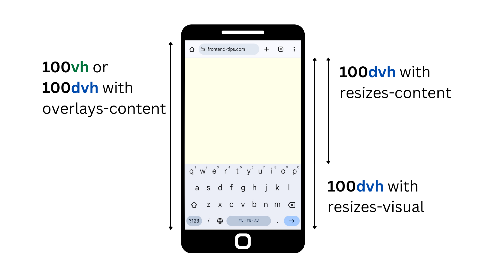
Why don't vw and vh work on mobile?
Are the vw and vh CSS units not working as you expect on mobile? This is a common problem. Mobile browsers often can't use the space of the entire screen due to other elements on the screen that takes up space, like the header or the keyboard. The vh and vw units still count the entire phone screen as part of the viewport - even if the content cannot use it.
If you specify an element to be 100vh and the header takes up 20% of the screen, your element will end up behind it, so you will need to scroll to see the entire element.
The solution: dvh and dvw
You can use the dvh and dvw units in combination with the viewport meta tag to solve this issue. These units account only for the space inside the actual browser screen. For instance, a 100dvh div will occupy only 80% of the screen if the header takes up 20%.

The keyboard is different
Keep in mind that to resize content when the keyboard appears, you also need to set interactive-widget=resizes-content in your viewport meta tag. Otherwise, the keyboard will count as usable space, causing it to overlap your content.
<meta name="viewport" content="width=device-width, initial-scale=1, interactive-widget=resizes-content" />100vhor100dvhwithinteractive-widget=overlays-contentwill position content behind the header and keyboard. The element will be scrollable.100dvhwithinteractive-widget=resizes-contentwill place content only within the visible space, ensuring no content is hidden behind the header or keyboard. The element will not be scrollable.100dvhwithinteractive-widget=resizes-visualwill place content behind the keyboard but not behind the header. The element will often be scrollable due to the header, but its height will not change when the keyboard appears.
Browser support
If you need to support very old browsers you can simply specify vw and vh as fallbacks by declaring them before the dvh and dvw. The browser will take the last specified style that it understands. The current browser support is strong as you can see on caniuse.com.
div {
  height: 100vh; /* for browsers that don't support dvh */
  height: 100dvh; /* for all other browsers */
}